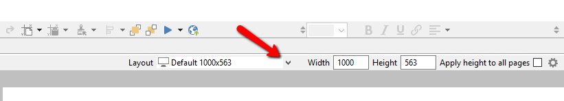
Every responsive layout created will contain the same objects and action logic, but you can adjust objects’ sizes and locations to for each layout. Other properties like the text, fill and line styles are linked across layouts. A key exception to this is media (images, audio and video). When you change media, it will only affect the current layout.
Tips
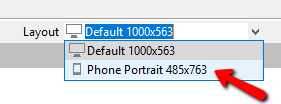
Tip You probably will not need more than two or three layouts. If you do not create a layout, the device will use the desktop (default) layout. For example, the desktop layout will typically provide a good learner experience on tablets in landscape or portrait mode. On the other hand, creating a phone portrait layout is usually required to provide a good experience since the screen size and aspect ratio is so different from desktop.
Tip The following tip is only relevant if you need more than the two or three layouts mentioned in the tip above: When you create a new layout, the size and placement of objects will default to those of the currently selected layout. Therefore, if your new layout (e.g. phone landscape, 785px) uses the same width as an existing layout (e.g. tablet portrait, 785px), you can save yourself time if you select a layout with a matching width before you create the new layout.