Lesson will remain the size indicated in the width and height settings no matter how the browser window is sized. If the browser window is smaller than the lesson size scroll bars will appear.

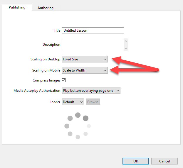
Scaling refers to how the lesson content is stretched, or not stretched, to fill the space available in the browser. The default scaling settings are Fixed Size for desktop viewing and Scale to Width for mobile viewing. These settings can be changed in the Edit menu > Lesson Settings > Publishing tab. Here you can adjust how the lesson will react to changes in the browser window size.

Fixed Size
Lesson will remain the size indicated in the width and height settings no matter how the browser window is sized. If the browser window is smaller than the lesson size scroll bars will appear.

Scale to Width
The lesson will scale to fill the browser window horizontally. If a page in the lesson is very tall, vertical scroll bars will appear.
Note In lessons that scale, to maintain a high quality look to your images, be sure to use graphics that will still look crisp when displayed at a larger size. The easiest way to do this is to create your graphic with dimensions that are twice the size of what you would use in a fixed size lesson.. You can also add additional detail by increasing the image resolution.
Scale to Width & Height
The lesson will scale to be as large as it can in the browser window without cutting anything off or using scroll bars, while also keeping the proportions consistent.
Note If your lesson uses variable page heights with some pages that are very tall, it is not recommended to use the Scale to Width & Height setting as this will force the taller pages to fit into the height of the browser window by shrinking all page elements, making these hard to read.