 |
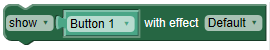
Shows or hides the object |
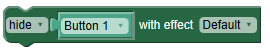 |
Shows or hides the object |
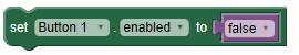 |
Enables or disables the button |
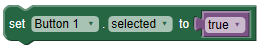 |
Sets the button state to selected/down if true, or normal if false |
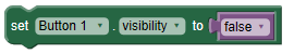 |
Shows or hides the object depending on the value provided. |
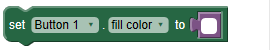 |
Sets the object's fill color to the provided color tile or hexadecimal value |
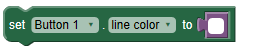 |
Sets the object's line color to the provided color tile or hexadecimal value |
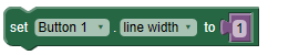 |
Sets the object's line width to the provided integer |
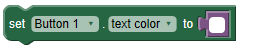 |
Sets the object's text color to the provided color tile or hexadecimal value |
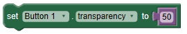 |
Sets the object's transparency to the provided integer |
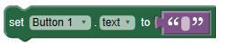 |
Sets the object's label to the provided text |
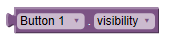 |
Returns true if the object is visible, false if it is not visible |
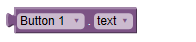 |
Returns the label of the object as text |
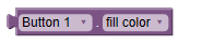 |
Returns the fill color as a hexadecimal value |
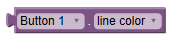 |
Returns the line color as a hexadecimal value |
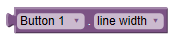 |
Returns the line width as an integer |
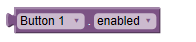 |
Returns true if the object is enabled, false if it is disabled |
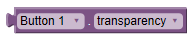 |
Returns the transparency as an integer |
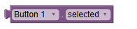 |
Returns true if the button is in a selected/down state, or false if it is in a normal state |