Best practice: On each page, create an action to set focus on your heading text, as shown in the example below.
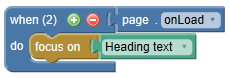
Rationale: When executing a back or next button on a master page, the focus would remain on the back/next button since the master page persists when changing pages. This could be confusing for screen reader users. By forcing focus onto the heading of the new page, users will understand that the page content has changed.
Alternatively, you can create back/next buttons on each page, rather than using back/next buttons on the master page. Since a regular page and its objects are ‘destroyed’ on page change, the focus would jump to the top of the browser. With this alternate navigation approach you would not need to set focus.
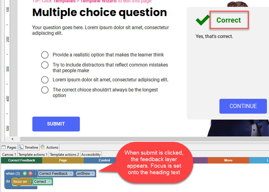
Best practice: When content within a page changes (e.g. when question feedback appears), set focus onto the new content.
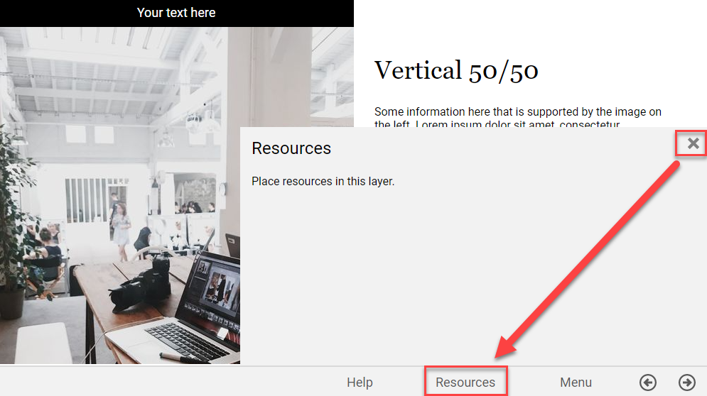
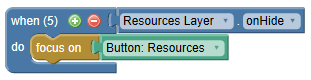
Best practice: If you hide a layer, set focus onto the appropriate base layer object. Usually this is the trigger object that shows the layer. In the example below, when the "x" button is used to close the “Resources” layer, focus is placed back onto the "Resources" button.
Rationale: When dynamic content appears/disappears, only sighted users will be aware of the change. By setting focus in a logical way, all users can understand the change.
Note You may wish to disable or hide some interactive objects when they are no longer needed. For example, a submit button that has been used should be disabled or hidden - simply covering it with a mask will stop users from being able to click on the button with the mouse, but they can still tab to those objects and select them again if the object is still enabled and visible.
Best practice: Use a style with the word ‘heading’ for the heading text. This will identify the text as a heading to screen reader users.
Rationale: Organizing web pages by headings helps users get a sense of the page’s organization and structure.
In general, interactive objects (e.g. buttons, radio buttons, links, dropdowns) are tab focusable, whereas static objects (e.g. text, shapes, images) are not tab focusable.
Tab focusable objects:
Best practice: By default, tab focus order is established automatically based on the focusable objects’ positions: left-to-right, top-to-bottom.
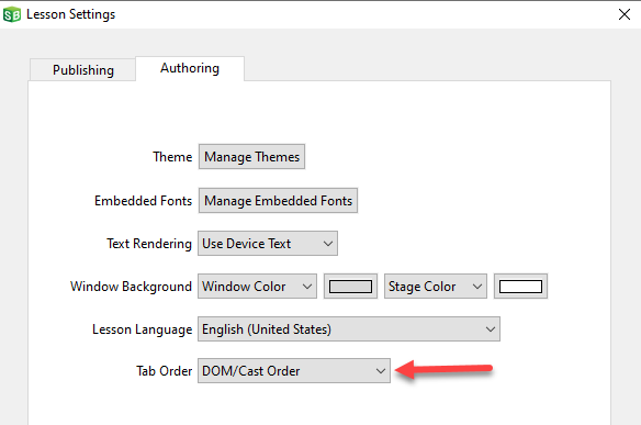
Alternative practice: Sometimes, you may wish to override the automatic position-based tab order by switching to use DOM/Cast Order in the Lesson Settings window.
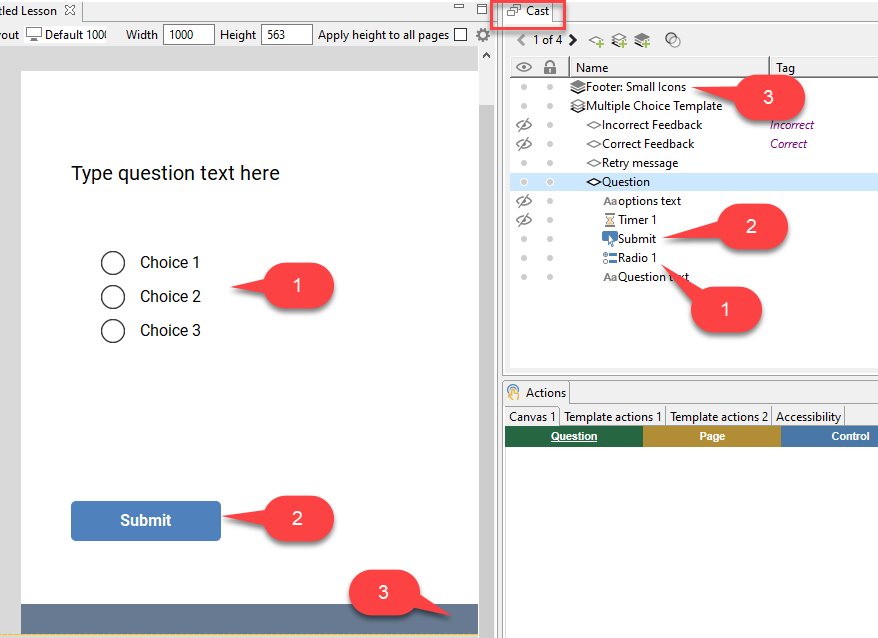
Objects lower down in the Cast will receive focus before objects higher in the Cast. In the example below, the radio buttons will receive tab focus first, followed by the Submit button, and then the items on the Master (called "Footer: Small Icons" in the example below) such as the back and Next buttons (not visible in the screen shot).
Rationale: Movement through a page should follow a logical order. It should mirror the visual order of navigation and controls on the page. Users who are navigating by keyboard (e.g., using the tab key) usually expect to move sequentially from left to right and top to bottom through the focusable elements on the page.
Note Do not leave unused interactive elements off screen and visible (for example a spare radio button object). A learner using the Tab key to navigate will find the object, and the screen may scroll over to view the object, misaligning the viewport. Make sure to delete or uncheck the Start Visible property on any left over objects so the screen reader cannot find them.
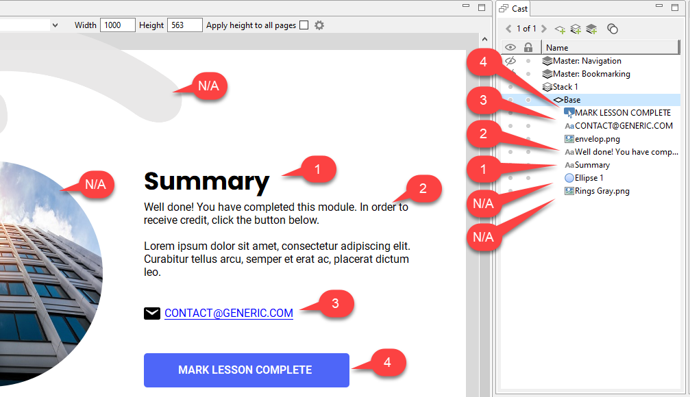
Best practice: Use the Cast to establish a read order that matches the visual order. Objects lower down in the Cast will be read by the screen reader before objects higher in the Cast. In the example below:
Rationale: Content should be read in a logical order that can be understood by screen reader users.
Best practice: Use the Description property for images to create a description (similar to an HTML alt text) that will be read by the screen reader. You may leave the Description blank. In this case, the image will be ignored by the screen reader.
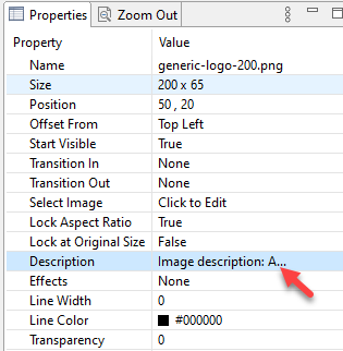
Rationale: People who use screen readers need descriptions because they can’t see, or have difficulty seeing, images.
Most objects will read the text displayed on the page, but some objects have additional information. See the list below for a breakdown of what each object exposes to the screen reader:
Buttons: Buttons will read the label, followed by the word "button". If there is no label, it will read the name of the object, which can be set in the Cast or the Properties panel.
Text: Text objects will read the contents of the text object. If the text object has a style with "Heading" in it, it will read that as a heading as well. See the section on "Use heading styles" for more information.
Rich Text: Behaves the same as regular Text objects.
Images: Unless a description is added, images will be ignored by the screen reader. See the section on "Add descriptions for images".
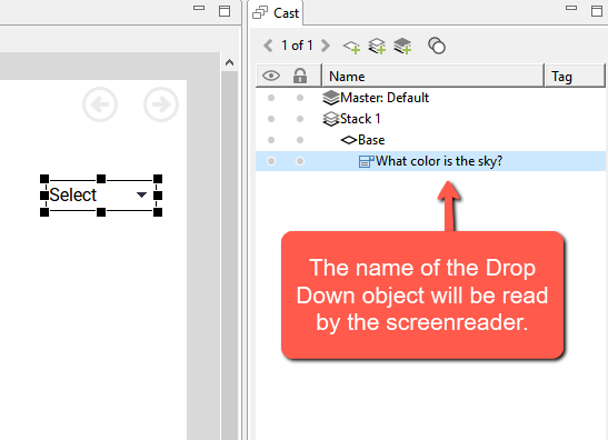
Drop Down: The screen reader will read the name of the object, the selected option, the type of object, and then the selected option number out of the total options available (e.g, "What color is the sky?, Blue, combo box 2 of 4"). It is important to properly name your drop down objects because screen reader users may read through the entire contents of a page before making selections, and may not have the context of a question prompt that is in close visual proximity.
Radio Button and Checkbox Groups: The option text will be read by the screen reader. Screen readers will also indicate if an option is selected or not (e.g., "Choice 2, radio button, selected" or "Option 5, check box, not checked").
Hotspots: Hotspots will be ignored by the screen reader. They are generally not recommended when creating accessible content. Text Input and Number Input: The name of the object in the Cast/Properties will be read, followed by the contents of the input field, and a notification that the text is editable (e.g., "Enter your name, James, edit text").
Popup Menu: The option text will be read first, followed by information about the currently selected option and the total number of items available (e.g., "Bananas, menu item 2 of 3, list item").
Best practice: Be sure to test your lesson with a screen reader in both read order and tab order to confirm that objects are being read as expected, and that each object provides enough context for a screen reader user to understand what is being asked of them.
Rationale: Some objects are more complex than others, and people who use screen readers cannot always see the relationship between a prompt and the interactive object meant to collect that response.