Use default or custom styles for button states
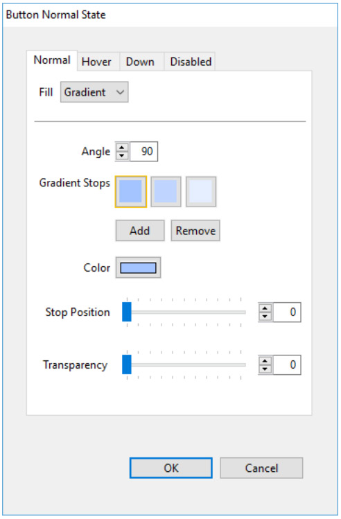
A default state is a variation of the normal state. For example, a button that is blue in its normal state will be lighter blue in its hover state, and darker blue in the down state. If you then change the normal state to red, the hover state will automatically change to lighter red, and the down state to darker red.
- Select the button you want to edit.
- In the Properties panel, click Fill.
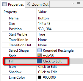
- Choose the tab for the state you want to edit - Normal, Hover (mouse roll-over), Down, or Disabled.
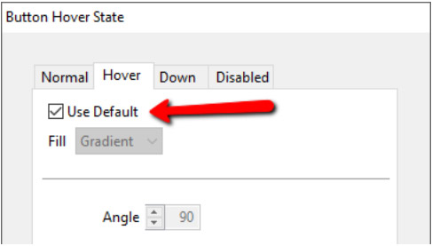
- Once you have set the normal state of a button, the hover, down and disabled states will use default rules to govern their appearance based on the normal state.
- To customize your button states, uncheck the Use Default checkbox. This will enable the options for that state, and allow you to make adjustments to that state. As you make changes, you will see a preview of that state on the authoring stage. When you accept the changes and close the window, it will show the normal state of the button on the authoring stage.